Back to Blog
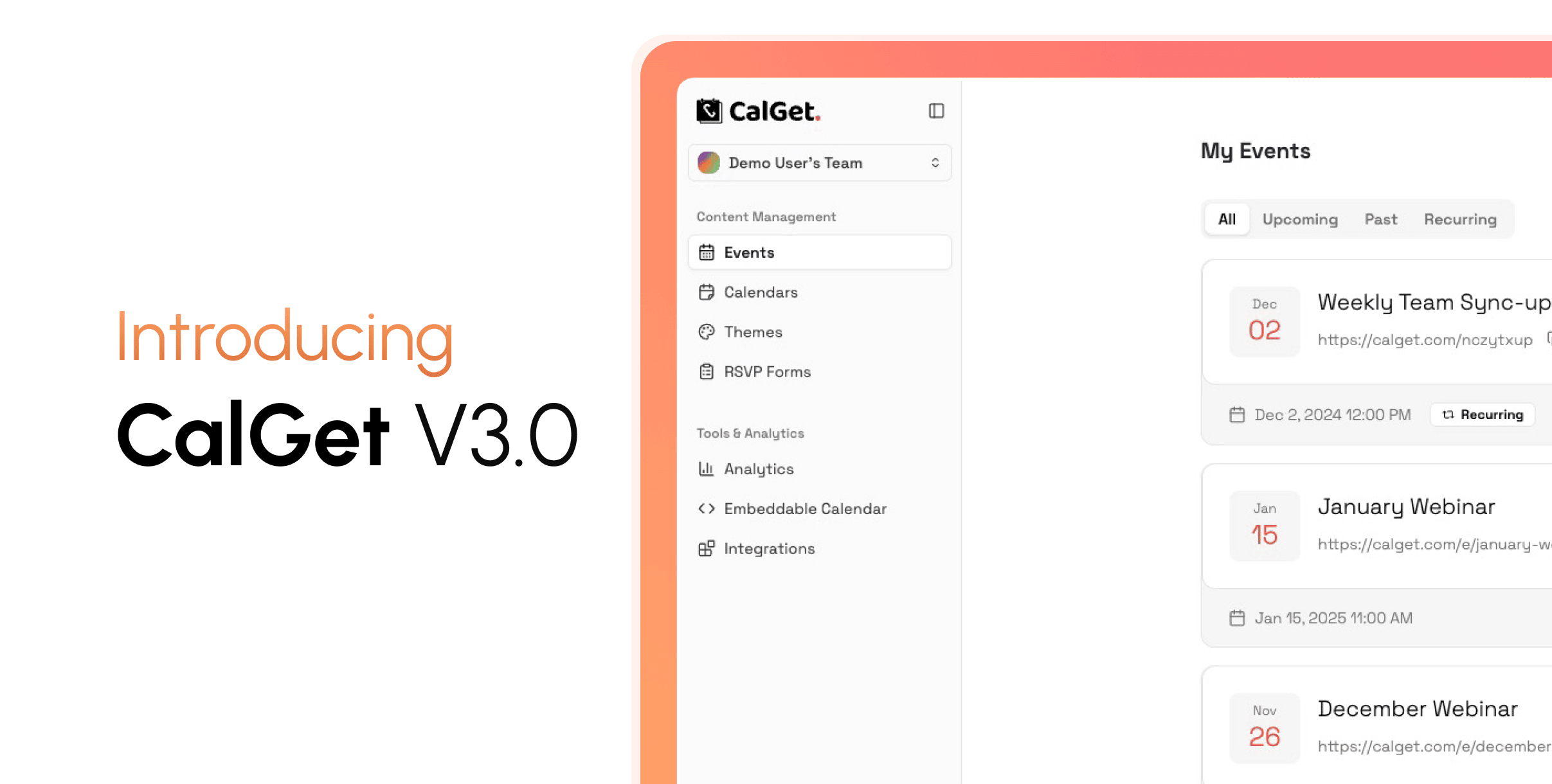
Introducing CalGet V3: Fast, Modern, Powerful
CalGet v3 is a ground-up redesign of the full platform: how it looks, how it feels, and how fast it works. New event page design, full theme control, better analytics and much more.
Written by
A Completely Reimagined Experience
CalGet v3 is a ground-up redesign of everything: how it looks, how it feels, and how fast it works. The entire app has been rebuilt with a modern, clean interface that's focused and a pleasure to use every day.
On desktop it's spacious and well-organized, with everything accessible without feeling cluttered. On mobile, every page (event creation, RSVP management, analytics, theme design) works beautifully. The experience feels intentional on any screen size, whether you're managing events from your desk or checking on RSVPs from your phone.
Throughout the app, actions complete instantly, and the interface responds to what you do without getting in your way. It's the same CalGet, just significantly faster, cleaner, and more capable.
Your Event Page, Redesigned from the Ground Up
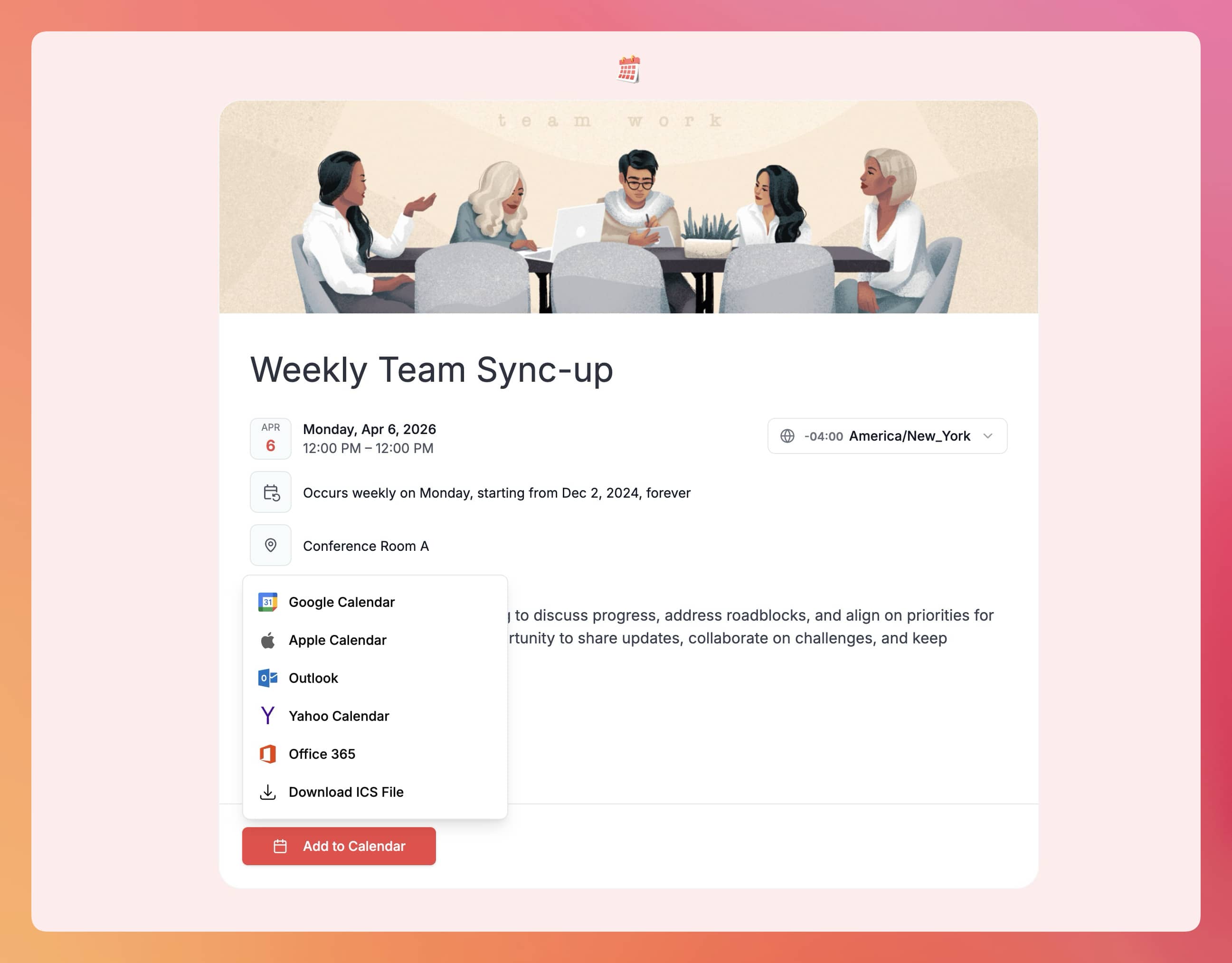
The public event page your attendees see has been completely rebuilt. It's modern, well-structured, and designed to make every event look its best.
Everything is presented clearly and in the right order: your branding at the top, the event details laid out cleanly, the description easy to read, the RSVP form simple to complete, and the Add-to-Calendar buttons right where people expect them.
Event descriptions now support up to 5,000 characters, a significant increase from the previous 1,000 character limit. You have the space to write a proper, detailed description without cutting anything out.
Visitors can adjust the displayed timezone to their own and switch between 12-hour and 24-hour time formats, directly on the page without any reload. This makes it easier for international audiences to know exactly when your event is in their local time.
Featured Images Every event can now have a cover image. Upload your own photo or pick one from our built-in stock photo library. The image appears prominently at the top of your event page and gives your event a polished, professional first impression from the moment someone opens the link.
The RSVP Form The RSVP experience has been redesigned to feel effortless. Picking a status, filling in any required fields, and submitting takes seconds. The whole flow is clean, intuitive, and gets out of the way. After submitting, attendees see a clear confirmation with your custom message.
Attendees who return to the page are recognized automatically. If they've already RSVP'd, their response is detected and they can update it seamlessly, with no friction or confusion.
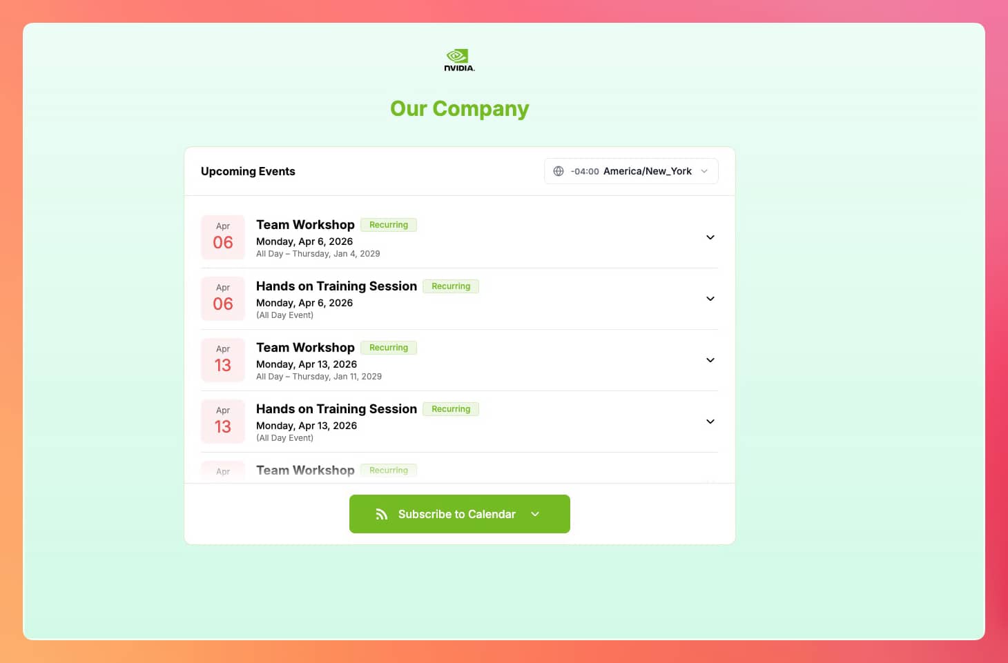
Your Public Calendar Page, Significantly Improved
The public-facing calendar page has been redesigned with the same level of care as the event page. The layout is cleaner and more polished, the event listing is easier to browse, and the overall experience is noticeably better whether your visitors are on a desktop or a phone.
On mobile in particular, the page adapts beautifully. Content is well-spaced, readable, and easy to interact with. Subscribing to the calendar or viewing event details works smoothly without any clunkiness.
Like the event page, the calendar page now includes a timezone selector. Visitors can switch to their local timezone and see all event times adjusted accordingly, a meaningful improvement for audiences across different regions.
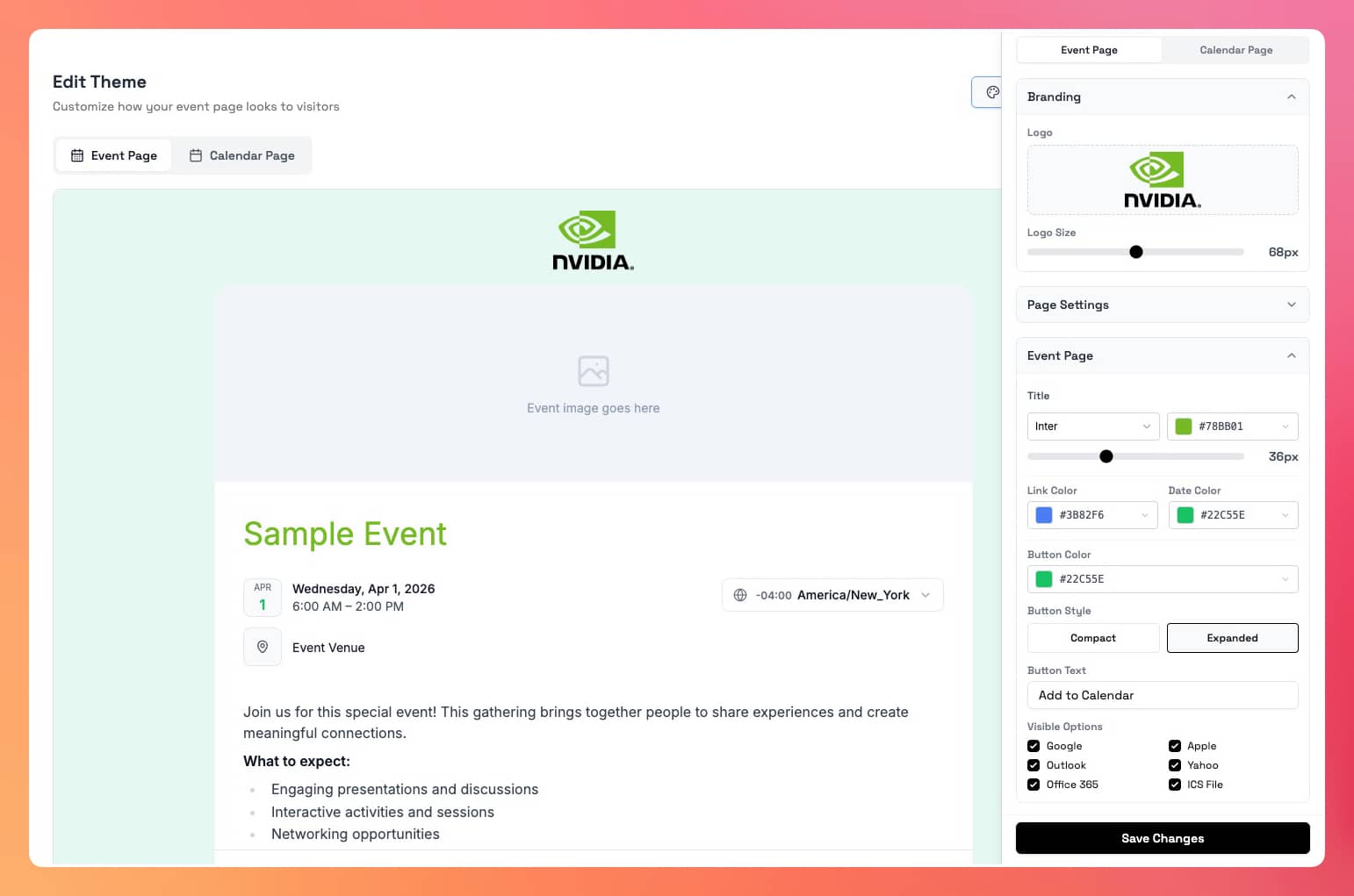
Themes and Branding: Full Control Over Your Look
The theme system has been rebuilt to give you real, hands-on control over how your event and calendar pages look. You're no longer limited to a handful of preset styles. Every key visual element is configurable, and a live preview shows you the result in real time, so what you see is exactly what your attendees will see.
Backgrounds Choose between a solid color, a gradient, or a full background image. The gradient option comes with a set of carefully curated presets (from subtle and professional to warm and expressive), or you can build your own with a custom color pair and your choice of direction. The image option lets you upload any photo or texture as the backdrop for your page.
Typography Set the font family and size for your event title and body text independently. You have access to a wide library of fonts and full control over sizing, from bold oversized headlines to light editorial body text. Your page can feel like it was typeset by a designer, because it was. By you.
Colors Every key color element on the page is individually adjustable: your title, your date highlight, your links, your calendar button. A palette of curated presets makes it quick, or you can enter your exact brand color for a perfect match.
Add-to-Calendar Button Customize the button color, the label text, and which calendar providers appear. You can also choose between two display styles: a compact dropdown that keeps the page clean, or an expanded layout that shows each calendar option as its own visible button. Show all providers or only the ones your audience actually uses: Google, Apple, Outlook, Yahoo, Office 365, and ICS download.
All of this applies to both your event pages and calendar pages. The result is a page that looks like it was designed for your brand, not a generic template.
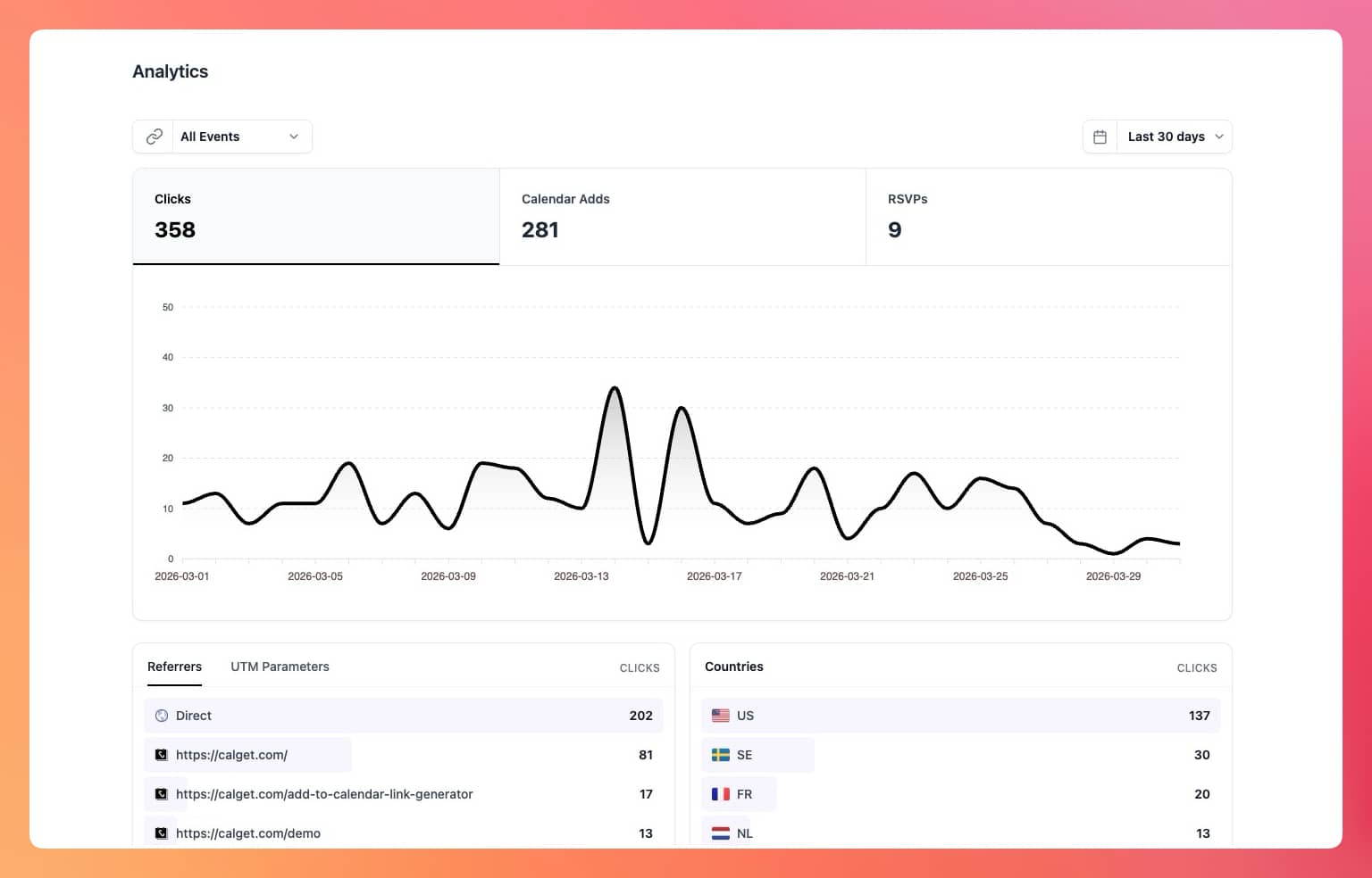
Analytics: Deeper Insights, Beautifully Presented
The analytics page has been completely redesigned. It's more organized, more informative, and significantly more powerful than before.
The previous version gave you a basic overview: total clicks, calendar adds, a dual-line chart, and limited breakdowns by referrer, country, device, and browser. That was a start. V3 goes much further.
At the top, three summary metrics (Clicks, Calendar Adds, and RSVPs) are presented as interactive cards. Clicking one switches the chart to show that metric's trend over time, making it easy to spot patterns and peaks at a glance.
Below the chart, four data panels give you a layered breakdown of your audience:
Where your traffic comes from See the referral domains driving visitors to your events, alongside full UTM campaign tracking. If you're running paid campaigns or email marketing, you can drill into source, medium, campaign, term, and content independently, so you know exactly what's working.
Where your audience is A geographic breakdown by country, shown cleanly with flags, so you can see at a glance where your reach is strongest.
How they're visiting A split by device type (desktop, tablet, mobile) and by operating system and browser. Useful for understanding your audience's environment and making sure your event pages look right for the majority.
Which calendar they use When looking at Calendar Adds, you can see the breakdown by provider: Google, Apple, Outlook, Yahoo, Office 365, and ICS. This tells you which integrations matter most to your actual audience.
Everything is filterable by date range (Today, Last 7 Days, Last 30 Days, Last Month, or Lifetime), and for team-wide views you can focus in on a specific event. It's a substantial step up in depth, clarity, and usefulness.
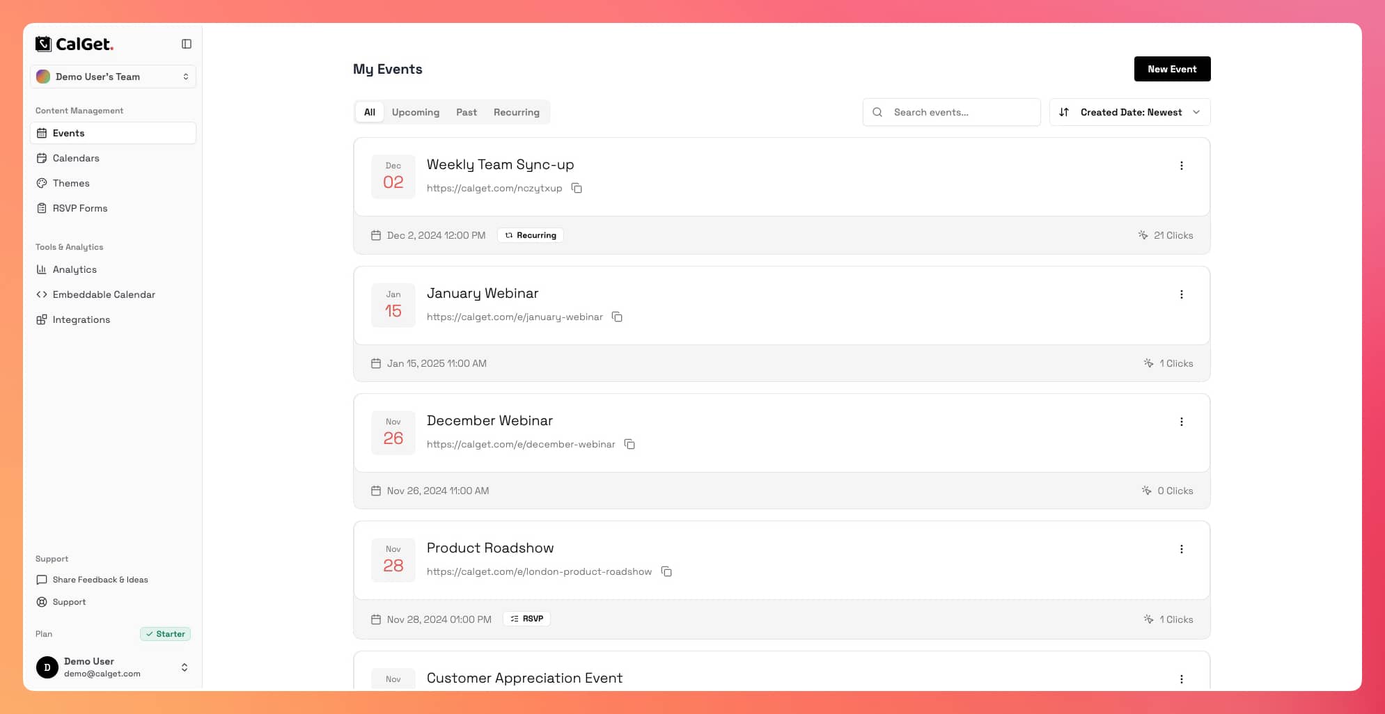
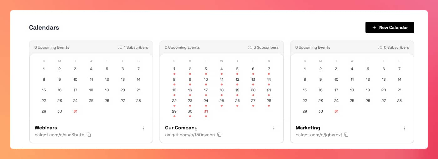
Mini Calendar on Every Calendar Card
Each of your calendars in the dashboard now shows a compact monthly calendar directly on its card. Your event dates are marked so you can immediately see what's scheduled, without having to open anything. It's a small change that makes managing multiple calendars noticeably faster.
Performance
The app is significantly faster. Moving between pages is instant. Saving, updating, or completing any action gives you immediate feedback and keeps you in flow. The interface no longer makes you wait.
Pages with large amounts of data (long event lists, RSVP responses, subscriber tables) load quickly regardless of how much you've built up over time. Everything is efficient and responsive, from the first click to the last.
Get Your Events on Everyone's Calendar.
Generate universal "Add to Calendar" links that work everywhere. Perfect for social media, emails, and websites.